Monday, September 30, 2013

Princess Margaret Showhouse 2013


Traditional details mixed with modern elements in this year's Hampton's style showhouse in support of the Princess Margaret Hospital Foundation. 

Though I often find these grand homes are a little too impersonal for my liking, I have to admit that I was impressed with the attention to detail in this year's showhouse.


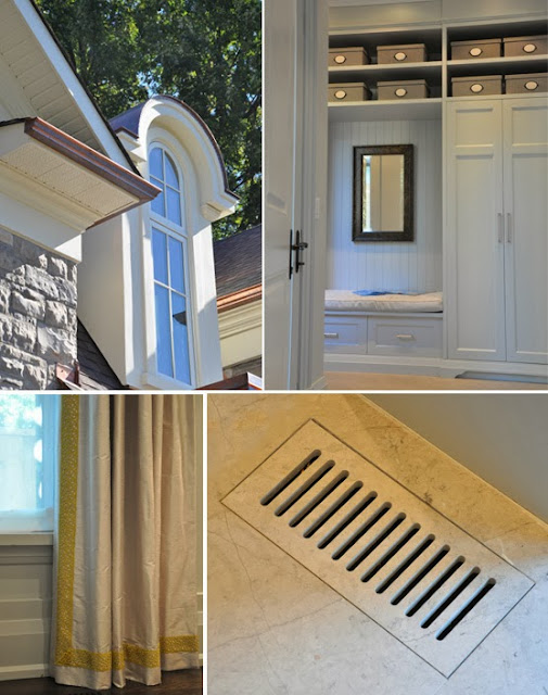
Nothing was overlooked. The smallest of details; everything from the copper eaves on the exterior to air vents seamlessly incorporated into the marble flooring in the family room were all carefully considered. 


Overall the interior design by Brian Gluckstein is elegant and restrained.

The drama begins just inside the front door with this two storey library. A bedroom on the upper level was sacrificed so that the library could reach up the full height of both floors. 

Instead of a traditional sofa and chairs, there are four club chairs around a circular table.


Across the front hall from the library is the living room. 

Here the color scheme was kept to lighter shades of creams, greys and gold. The accent pillows are luxurious satins and silks with beautiful embroidered detailing.


 In the wide foyer that leads to the back of the house, Gluckstein took a photograph of a Versailles interior and had it enlarged to make a mural that is 8 or 9 feet in length.  


To sit beneath this large scale artwork, he designed a clean, contemporary bench with a soft cushion cover that is held in place with two decorative ribbon trims. 

Outdoor lanterns that sit on lacquered pedestals add a touch of drama to the lighting at night.


Between the dining room (above) and the kitchen there is a small servery with a glass 
floor that opens onto the wine cellar below(not shown)


The open kitchen, breakfast area and family room are located at the back of the house. 

The family room has a modern feel with a limestone mantle flanked by tall bookcases. On an adjacent wall, there is a big screen television (television not shown on the left) and rows of horizontal plate rails that hold a collection of black and white photographs. 


As you can see on the right, all the draperies have beautiful detailing.


Just off the great room, there is a small home office with a oversized cork board covered with inspiration.


On the lower level, there is an exercise room complete with a big screen television. Who wouldn't want to work out in a room like this?


At the opposite end of basement, there is a home entertainment room complete with a bar.


The main area of the media room is perfect for cozying up and watching movies. 


As well as a spa-like bathroom and a guest bedroom on this level, there is also laundry room 
with a pet grooming area.


Finally let's head upstairs. Here there is a generous master bedroom with a walk-in closet that can be accessed through doorways on either side of the four poster bed.


The master ensuite has a two person tub, heated flowers, matching his and her vanities, a rain shower, water closet and what has become a bit of a signature for the designer: a small library.


In the central hallway on the upper level, Gluckstein has hung a gallery of photographs featuring gardens from all over the world. To complete this garden oasis, he has adding a contemporary table covered with glass topiaries, orchids and candles.

Are you surprised that this foyer was one of my favourite spaces?

The 2013 Princess Margaret showhome is currently open for public viewing. For details please see the information and links below.

More information and links:

This year's showhome is located at 1522 Devon Rd. in Oakville. Hours are: weekdays from 1pm to 8pm; weekends and holidays from noon to 5pm.


Wednesday, May 15, 2013

More Favourite Finds


Pinwheels $1
Square Plates $2
Vanilla Cupcakes filled with vanilla pudding

What makes grocery shopping fun for me is veering off into the floral department or straying into the isles of seasonal and kitchen accessories. Here are some of my favourite finds from a recent trip to my local Real Canadian Superstore ®.


Foxy Plate $4
Plastic Animal Glass $2


Colorful set of plastic Measuring Cups $2
Plastic Colander great for rinsing summer fruit and berries $4


Disposable Table Cover $3
Plastic Leaf Plate $4


Patio Lanterns in 4 colors $5


Party Favour Stamps $1


Toy Trucks $1
(for children 3 years of age or older)


Set of 4 Bamboo Ice Cream Dishes with spoons $7
Floral Plate Mat $1

Wednesday, February 6, 2013

Favourite Finds


The SKURAR Flower Pot from Ikea 

In Canada it is only $3.99!


I love the lace edge.

I am going to link this post to Clever Chicks Blog Hop and Sunlit Sundays. 
To find other great posts, please click the links.

Monday, February 4, 2013

A few more Highlights from the Interior Design Show


I have a few more highlights from this year's Interior Design Show for you today.


This concept spaces for this year's show were themed "How do you work?". The participating designers were invited to transform a 160 square foot shipping container into a dynamic and innovative workspace. 

Using floral tiles, wallpaper, painted wood flooring and Italian furnishings the designers at igloodgn transformed their space into a workspace for a botanist.


The interesting floor treatment caught my eye.


This workspace was designed by Debbeldam Architecture and Design.


Colorful, contemporary design at BoConcept.


CasaLife furniture and accessories.


Hollywood glamour at Emily Quinn


Sinks from Stone Forrest


Pink, cream and tangerine! This was one of my favourite displays.

Tuesday, January 29, 2013

Highlights from the Interior Design Show 2013


There was lots to see at big Interior Design Show that was held last weekend here in Toronto. I thought that I would start by showing you the Ikea displays, which won the Gold Booth Award at the show.

I have always thought of Ikea as right-out-of-college or first-apartment-furnishings, haven't you? 

Well-designed, yes, affordable, certainly, but even so, I always have thought of Ikea as moderate quality furniture that you would want to replace the moment you could afford the "real" grown-up stuff.

In the last few years however, Ikea has been making serious inroads into the kitchen cabinet business here in Canada by bringing high-end cabinet styling down to a price point that just about anyone can afford. 

The company's advertising has been really smart and effective. I have found myself looking at their glossy, two-page ads and thinking, wow, that's Ikea? 

And in this, I am not alone. Local interior designers have been really embraced this new Ikea product range.


With its grand scale, the Ikea booth's kitchen design was reminiscent of a warehouse space that you see in many downtown condo conversions.

Featured was the company's newest light grey walnut cabinet doors (SOFIELUND), rough barn board floors, neutral countertops and a statement-making cluster of pendant light fixtures over the center island.


With over-scale wall tiles that had the look of distressed leather and a floating blonde vanity, the 
Ikea bathroom was just as incredible.


Flanking either side of the vanity, were two oversized cabinets in 
white-stained oak (GODMORGON).


Opposite the vanity, there was this amazing copper tub.

Wait. Did you notice the grouping of light fixtures? They had all the magic of fireworks!


The rough barn boards on the floor, grey-brick fireplace, animal skin rugs, and warehouse-style windows all enhanced the space's cool, downtown-industrial-loft-feel.

More highlights from the show up shortly.